KMPC
MEN
(GHITORNI · ND · 2020)
(RETAIL)

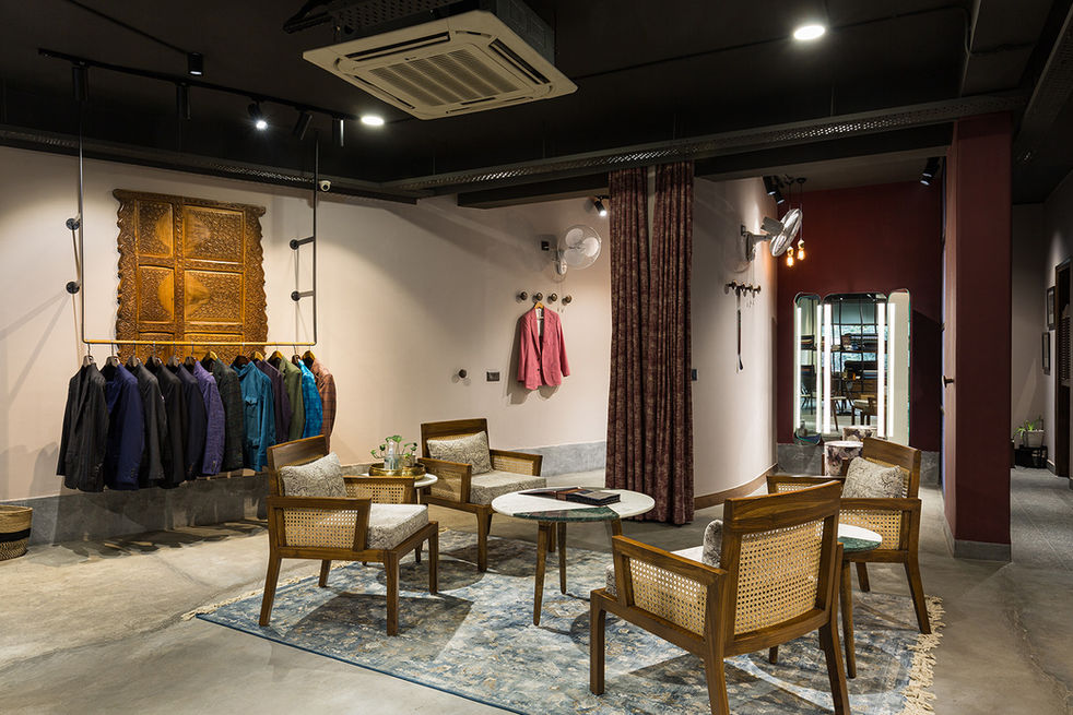
A menswear fabric & retail store developed to merge two brands Vesilio_men (fabrics) & KMPC | Men (tailoring). The design tried to create a natural light filled open space which reflects pedigree for both the fabric and tailoring. Without veering too much towards masculinity or being color shy.
This project has been awarded Merit 2 In the Vmrd Western Fashion Apparel & Accessories Store 2023 awards
CREDITS, PRESS & AWARDS
DESIGN TEAM.
AMEET SINGH, DB TEAM
3D ILLUSTRATIONS.
DESIGN BUREAU
PHOTOGRAPHER.
ROHAN DAYAL

We interpreted the brief through marrying an Indian earthy craft sensibility with the Italian fondness for vaults, arches and crafted detail. The space was configured as a series of two fabric lounges divided by a floating floor to ceiling display unit, with shelving and display along all the walls & two large trail rooms having large trifold backlit mirrors, a small designers studio, a pantry and a unisex toilet. The showroom space consisted of a series of spatial interventions i.e. True brick Arch (showroom entrance), POP Vault (foyer), Structural floor to ceiling MS powder coated display units, MS box section glazed partitions/doors & freestanding reconfigurable VM areas (with some fixed design elements such as custom large lathed wooden knobs).


ABOUT.
AREA.
2000 SQFT · 186 SQM
ROOMS.
FOYER · SHOWROOM · STUDIO · CHANGING ROOMS · SERVICE AREAS
HIGHLIGHTS.
TRUE BRICK ARCHES · POP VAULT · FREE STANDING FLOATING CUSTOM SHELVES · COLOR INTENSIVE GENDER NEUTRAL DESIGN · COST EFFECTIVE DESIGN INTERVENTIONS
The central display unit was anchored with hidden fixing details to the ceiling and floor and the central portion of it was used for display and floating drawers. The Clear height of 9’6” made us go for an open ceiling with exposed services and track lighting to maintain a sense of space. We used 4000k COB track lights with a high CRI for good color reproduction of the fabrics as a base lighting strategy.
Luckily the project offered us a large floor plate and we decided to not shy away from color and use a gender neutral yet bold color scheme of contrasting VineYard & Ivory shades. Vineyard became the brand color and was used for signage as well. Existing floor to ceiling windows towards the north west brought in ample sunlight but had to be tamed with partial frosting which screened both the overhead metro line and heavy traffic of the NH 148A. This also gave us the added benefit of framing the green foliage of the surrounding trees.


